
Predicting zinc concentration in meuse using Gaussian Processes using GPBoost in R
 Source: photo by Luis Miguel Justino under CC BY-NC-ND 2.0 license
The Meuse River, located in Western Europe, has historically been known to be contaminated with heavy metals, including zinc. This contamination has been linked to industrial activities, mining operations, and agricultural practices that release pollutants into the river and its surrounding floodplains. The Meuse River has been the subject of extensive research in the field of environmental science due to the severe health and ecological implications of heavy metal contamination. The Meuse data availabe in sp package in R, which contains information on zinc concentration in the topsoil of the river’s floodplain, is one example of the many studies that have been conducted on this topic. This dataset has been widely used in demonstrating geostatistical tools and methods in R using model-based geostatistics like R package gstat, and geoR, and ensemble ML. Please also see these resources; Intro to geostats with R and others.
In this blog post, we use a new tool available in R, GPBoost, to model the zinc concentration in the Meuse River floodplain. GPBoost is a package that implements the Gaussian Process Boosting algorithm in R. This algorithm is a powerful tool that can be used to model spatial data, including those with the temporal component. The GPBoost software library enables combining tree-boosting (appropriate for modelling non-linear relationships), Gaussian process (GP), and grouped random effects models (also known as mixed effects models or latent Gaussian models) to take advantage of their strengths and address their weaknesses.
In this blog post I will only demonstrate the use case of GPBoost to model the zinc concentration in the Meuse River floodplain using maximum likelihood estimation (MLE). In the future, I will demonstrate how to use the GPBoost package to model the zinc concentration in the Meuse River floodplain using boosted methods.
Load R packages
packages <- c("gpboost", "terra", "sf", "sp", "tidyverse", "scico", "cowplot")
purrr::map(packages, library, character.only = TRUE)
Load data and arrange
# data from sp package
data(list = c("meuse","meuse.riv","meuse.grid"))

# convert meuse data to sf objects
meuse <- meuse |> st_as_sf(coords = c("x","y"))
# create river polygon from riv points for plotting
river <- meuse.riv |> as.data.frame() |>
  st_as_sf(coords = c("V1", "V2")) |> st_combine() |>
  st_cast("POLYGON")
I like to make plots using ggplot
# plot zinc concentration and the meuse river
p1 <- ggplot()+
  geom_sf(data = river, fill = "gray", col = NA) +
  geom_sf(data = meuse, aes(col = (zinc)), size = 3) +
  scale_color_scico(palette = "lajolla", name = "Zinc\n conc (ppm)") +
  labs(title = "Zinc concentration marked points\n along the meuse river",
    x = "", y = "") +
  coord_sf(ylim = c(329000, 334000), xlim = c(178300, 181700)) + # zoom
  annotate("text", x = 179000, y = 333500,
           label = paste0("n = ", nrow(meuse)), size = 5) +
  theme_minimal(base_size = 20) +
  theme(legend.position = c(1.2, 0.4), # position the legend
        axis.text.x = element_blank(), # remove the coordinates
        axis.text.y = element_blank())

p1

# save the plot
ggsave("meuse_zinc.png", p1,
  width = 10, height = 7,
  units = "in", dpi = 300)
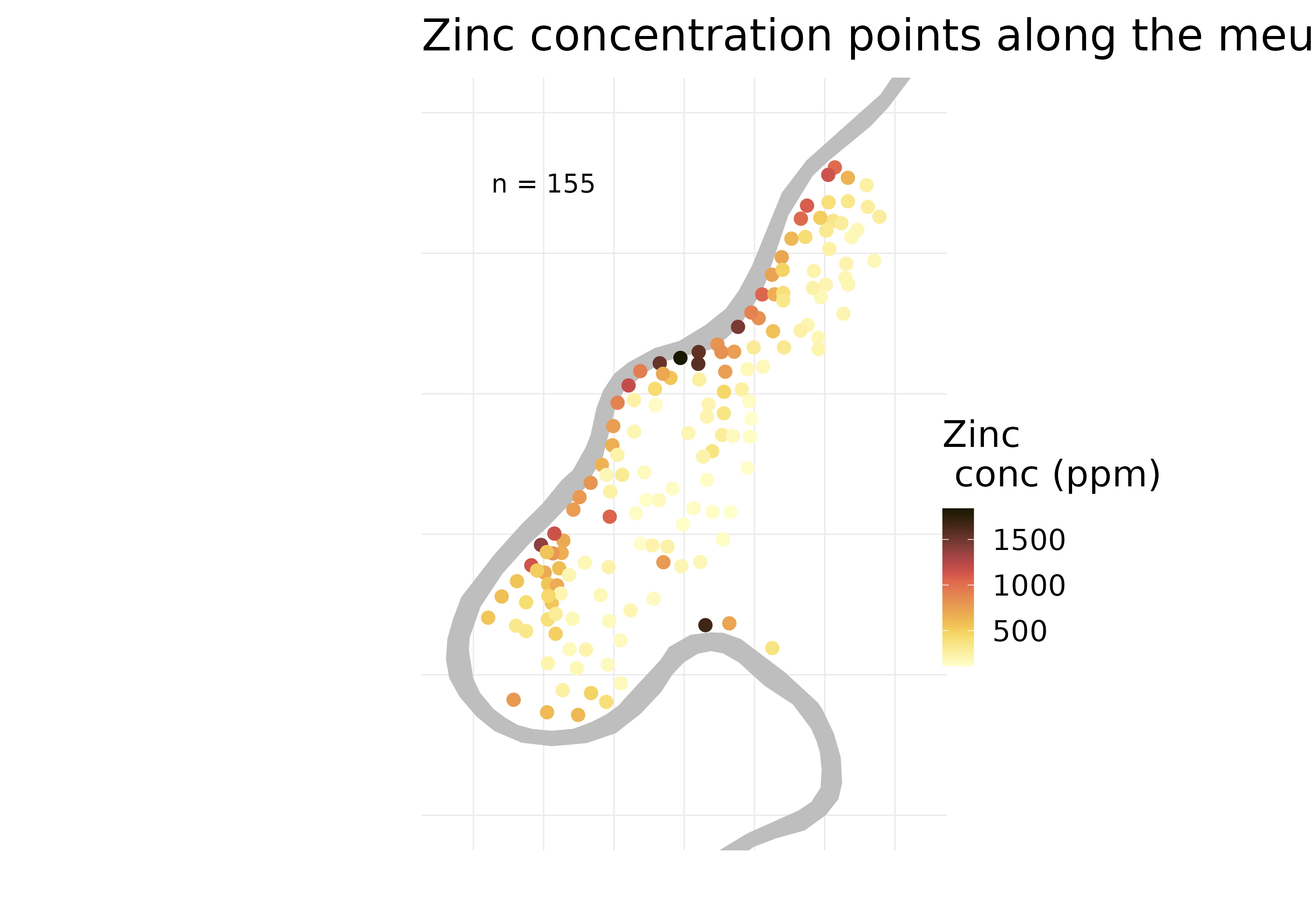
The plot shows the zinc concentration in the Meuse River floodplain. The grey polygon shows the river. The zinc concentration is shown as a color scale, measured in parts per million (ppm). It’s quite evident that zinc concentration is highest along the river and decreases as we move away from the river.
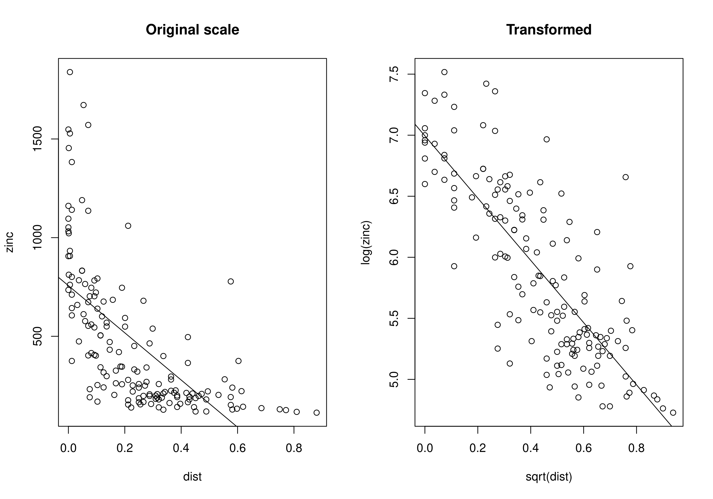
We can check this relationship using a scatter plot and a regression line. It is clear that zinc concentration is higher along the river and decreases as we move away from the river. But also it looks like transforming the data might help to improve the fit of the regression line i.e., log transformation of zinc concentration and square root transformation of distance from the river. So, we will use the transformed data to fit the GPBoost model.
# plot zinc and distance to river relationship (using base R plot)

png("meuse_zinc_dist_scatter.png",
    width = 10, height = 7, units = "in", res = 300)

# Set the layout for the plots
par(mfrow = c(1, 2))

# Generate the scatter with the original scale
plot(zinc ~ dist, meuse, main = "Original scale")
abline(lm(zinc ~ dist, meuse))

# Generate the scatter with the data transformed
plot(log(zinc) ~ sqrt(dist), meuse, main = "Transformed")
abline(lm(log(zinc) ~ sqrt(dist), meuse))

dev.off()

# Reset the layout to default
par(mfrow = c(1, 1))
For convenience let’s just create a new dataframe (df) and add the transformed data to it.
# transform the response and the predictor
df <- meuse |>
  mutate(log_zinc = log(zinc),
         sqrt_dist = sqrt(dist)) |>
  st_drop_geometry() # remove the geometry column
Before making any prediction we need to test our model. So first we split the data into training and testing sets. We will use 80% of the data for training and 20% for testing.
# split data into training and validation sets (80/20)
set.seed(2022)
train <- sample(1:nrow(df), 0.8*nrow(df))
test <- setdiff(1:nrow(df), train)
Split the coordinates, response and predictors into training and testing sets.
# get coordinates of sample points
coords <- meuse |> st_coordinates() # to train the full model
coords_train <- coords[train, ] # training coords
coords_test <- coords[test, ] # testing coords

# we will denote **numeric response with y** and
# the **matrix of predictors with X**

# response
y <- df |> pull("log_zinc")
y_test <- y[test]
y_train <- y[train]

# predictor/s
covs_to_model <- "sqrt_dist" # only distance in this example

X <- df |> select(covs_to_model) |> as.matrix() # gpboost requires matrix
X <- cbind(1, X) # to fit a model with intercept
X_train <- X[train, ]
X_test <- X[test, ]
To evaluate model performance, we will used MSE (Mean Squared Error) a commonly used metric for model evaluation, particularly in regression problems. It measures the average squared difference between the predicted values and the actual values of a dataset. A smaller MSE indicates that the model predictions are closer to the actual values, whereas a larger MSE indicates greater deviation between the predicted and actual values. MSE is easy to understand and interpret, but is sensitive to outliers and assumes errors are normally distributed. It should be used in conjunction with other metrics.
More importantly, we would need to do a cross-validation (and ideally a spatial nested-cross validation) to get a better estimate of the model performance. Cross-validation also helps in tuning the models; e.g., choosing the covariance function e.g., exponential or matern that gives the lowest error. For this blog, we will just use MSE and no cross-validation. We also specify the covariance function to be exponential.
# estimate the MSE using the training and the testing samples

# create GP model
gp_model_train <- GPModel(
  gp_coords = coords_train,
  cov_function = "exponential",
  likelihood="gaussian")

model_train <- fit(
  gp_model_train,
  y = y_train, X = X_train,
  params = list(std_dev = TRUE))

# predict on the test data
pred_test <- predict(
  model_train,
  gp_coords_pred = coords_test,
  X_pred = X_test)

# calculate MSE
MSE <- mean((pred_test$mu - y_test)^2)
MSE
[1] 0.125
In this case, an MSE score of 0.125 could be considered a good score, as it suggests that the model is able to accurately predict the target variable for the given dataset with relatively low error.
So after testing the models we can now fit the model to the full dataset and make predictions. Rather than specifying the gpmodel and then fitting it (as we did earlier in making predictions on the test set), we can use the fitGPModel function to fit the model directly.
# use all data to fit the model
gp_model <- fitGPModel(
  gp_coords = coords,
  cov_function = "exponential",
  likelihood="gaussian",
  y = y, X = X,
  params = list(std_dev = TRUE))

# see summary statistics of the model
summary(gp_model)
We also need to create a raster grid to predict the response variable.
# create a raster grid
cov_rast <- rast(meuse.grid)

# coordinates of the grid
coords_grid <- as.matrix(
  xyFromCell(cov_rast[[1]], 1:ncell(cov_rast[[1]])))  # use any raster

# predictor on the grid
X_grid <- cov_rast[[1]] # use any raster layer
X_grid <- sqrt(X_grid) |> as.matrix() # transform the predictor
X_grid <- cbind(1, X_grid) # add 1 for intercept
Time to predict on the grid.
pred <- predict(
  gp_model,
  gp_coords_pred = coords_grid,
  X_pred = X_grid,
  predict_var = TRUE) # specify to predict variance
Assign the predicted values to the raster grid.
# mu - the predicted (posterior) mean of GP
pred_mean <- cov_rast[[1]] |> # get any grid layer
  setValues(exp(pred$mu)) |> # transform back to original scale
  setNames("Zinc")

# var - predicted variance
pred_var <- cov_rast[[1]] |> # get any grid layer
  setValues(exp(pred$var)) |> # transform back to original scale
  setNames("variance")
Finally, make some nice plots using ggplot2.
# convert raster to dataframe for plotting
df_plot <- data.frame(
  xyFromCell(pred_mean, 1:ncell(pred_mean)),
  mu = as.vector(pred_mean),
  var = as.vector(pred_var))

# remove areas outside of ROI
df_plot <- drop_na(df_plot, mu)

# a plot function to make plots (or else you will just have to repeat the same code)

# a plot function for not repeating
make_plot <- function(vars, titles) {
  ggplot() +
    geom_raster(data = df_plot, aes(x = x, y = y, fill = get(vars))) +
    scale_fill_scico(palette = "lajolla", name = "zinc ppm") +
    geom_sf(data = river) +
    labs(title = titles, x = " ", y = " ") +
    coord_sf(ylim = c(329000, 334000), xlim = c(178300, 181700)) + # zoom in to this extent
    theme_minimal(base_size = 15) +
    theme(axis.text.x = element_blank(), # remove the coordinates
          axis.text.y = element_blank())
}

vars <- c("mu","var")
titles <- c("Predicted zinc conc", "Predicted variance")

plot_list <- purrr::map2(vars, titles, ~ make_plot(vars = .x, titles = .y))
p2 <- cowplot::plot_grid(plotlist = plot_list, ncol = 2)
p2

ggsave("predict_zinc.png", p2,
  width = 10, height = 7,
  units = "in", dpi = 300,
  bg = "white")
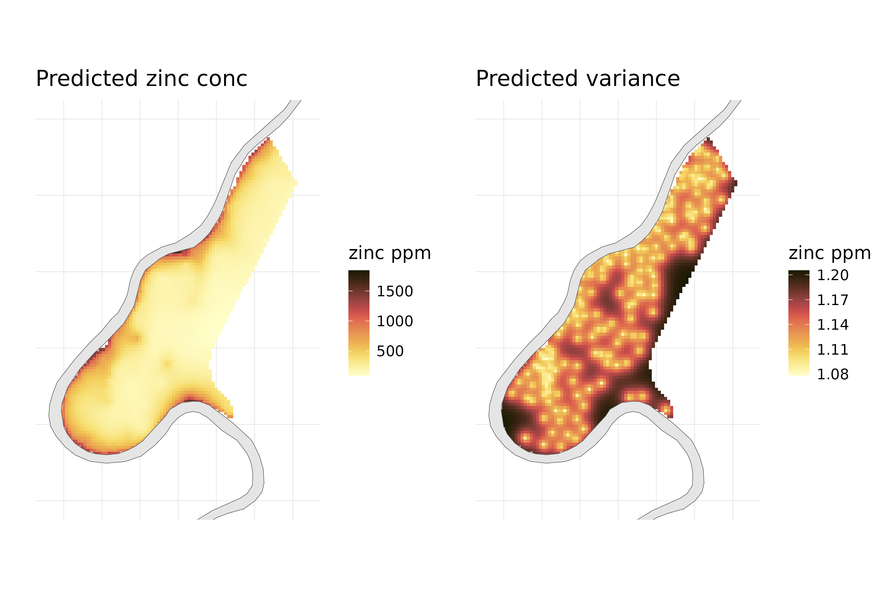
Here are the final predicted maps. The variance plots are also informative to see where the model is more uncertain.
In this blog, I showed how GPBoost can be used to predict a continuous response variable. Although the more powerful use of this package can come from modelling non-linear data using tree-based models and combining it with the GP. I will try to cover that in a future blog.
Thanks for reading. I hope the codes can be useful to you.
Important references
- Bivand, R. S., Pebesma, E. J., Gomez-Rubio, V., & Pebesma, E. J. (2013). Applied spatial data analysis with R (Vol. 747248717, pp. 237-268). New York: Springer.
- Pebesma, E., & Gräler, B. (2014). Spatio-temporal geostatistics using gstat. R J, 903.